The challenge
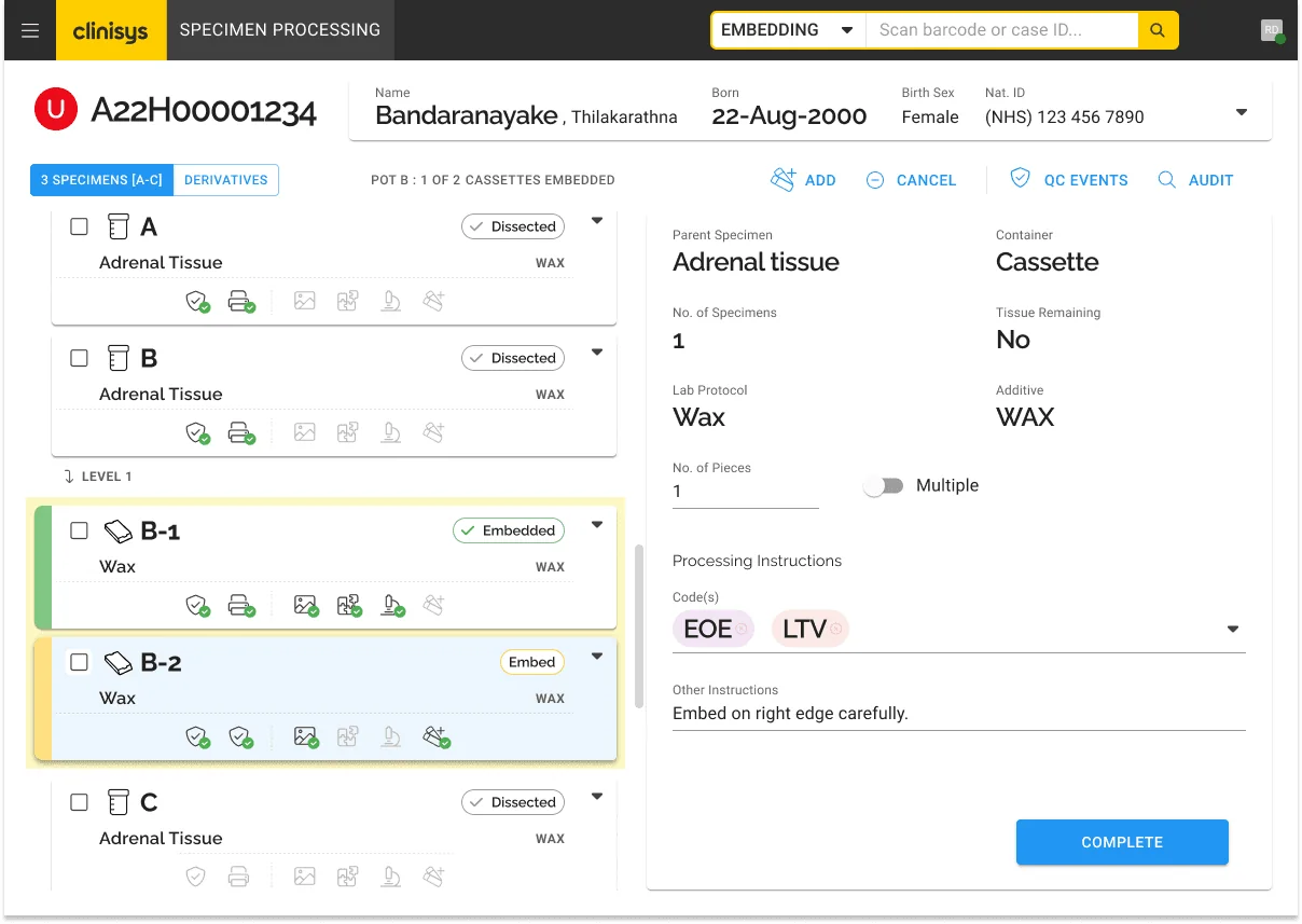
Clinisys provides laboratory informatics that process diagnostic results every day, from routine blood work to complex genomic analysis. The product suite had grown through acquisition and organic development across several countries, which left fragmented interfaces, inconsistent interaction patterns and no unified design system.
Technicians processing results at speed were navigating different UI conventions from module to module, raising cognitive load and clinical risk. I joined a central design team of six as Lead UX Designer. No designer had been embedded in the engineering squads before, so I worked across five of them to design solutions, build design culture, unify the experience and create a scalable system.
Domain immersion
I spent my first weeks in training and in pathology labs, watching technicians run sample processing on WinPath Enterprise, the LIMS behind pathology networks such as Black Country Pathology Services. I shadowed results validation in microbiology, watched quality-control handoffs between disciplines, and mapped the moments where attention splits between the screen and the physical sample.
Five principles
From the immersion I set five principles that governed every design decision, and that product managers and engineers went on to use when evaluating features and settling scope debates.
- Precision over decoration
- Every element earns its place. Decorative dividers and gradients were stripped from results validation because they compete with clinical data.
- Consistency across contexts
- A validation screen behaves identically during grossing, microtomy or embedding, adapting to each workstation rather than fragmenting into separate views.
- Progressive complexity
- Surface the 80% case; reveal specialist controls in context, so one interface scales from a routine blood panel to a genomic assay.
- Error prevention over recovery
- Inline validation, confirmation gates at irreversible steps and smart defaults, because here an error can mean a misdiagnosis.
- Beyond-baseline accessibility
- WCAG 2.2 AA as the floor. Touch targets went well past the minimum for gloved hands on cluttered benches, often viewed from a distance.
Competing needs
Three groups with fundamentally different needs worked in the same system:
- Lab technicians
- Speed and scannability, processing hundreds of samples a shift.
- Quality-control officers
- Traceability and audit depth, drilling into any result to see its full provenance.
- Lab managers and network directors
- Oversight: throughput, turnaround and compliance across multiple sites.
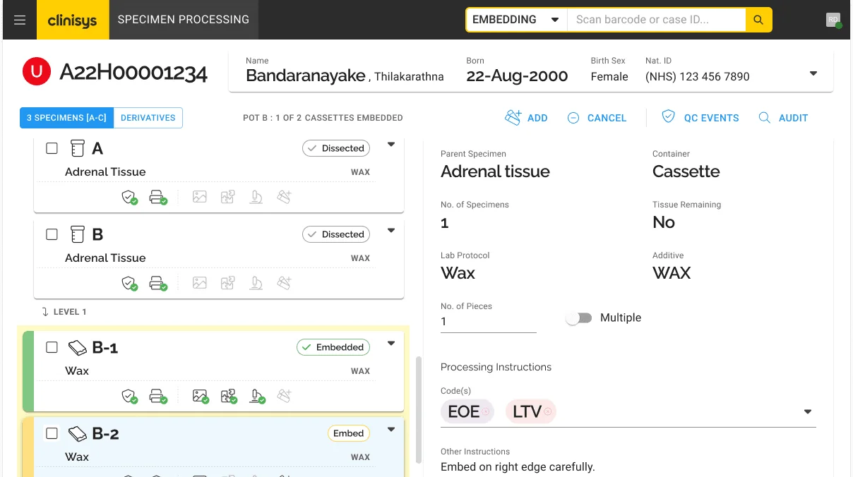
Separate interfaces weren't the answer. I redesigned sample processing, results validation and quality control around progressive disclosure, role-based views and contextual information density, with a one-click switch between views and a default that stays focused on the task in hand.
The design system
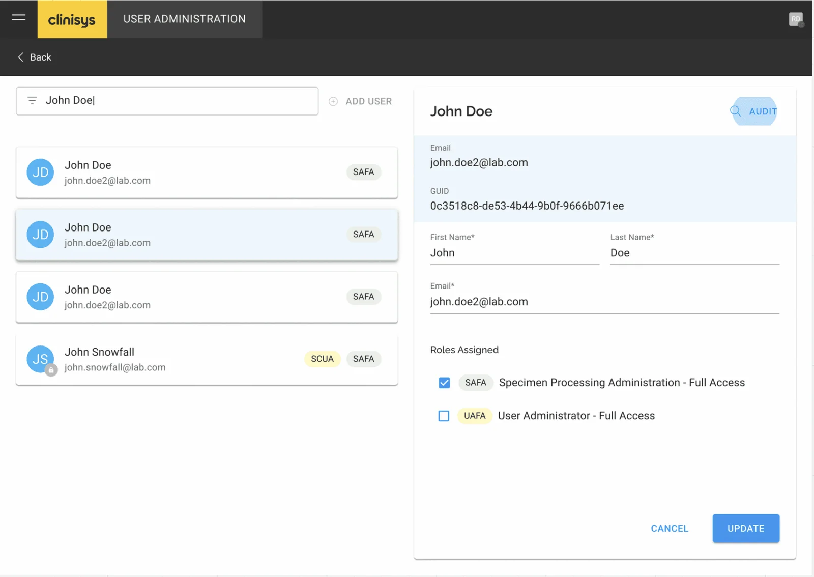
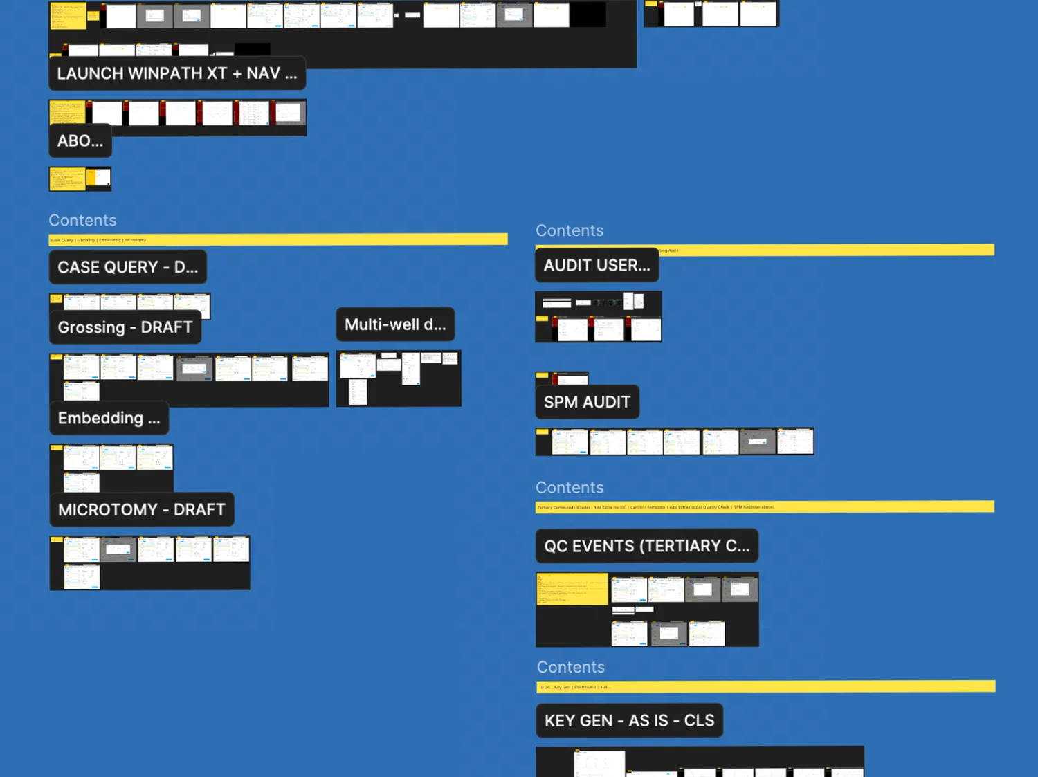
I defined the design direction and component architecture for a branded, Material UI-based, token-driven system covering desktop, tablet and proprietary instrument displays. It grew to 200+ documented, governed components and was adopted worldwide. It was a team effort, and I want to be precise about who did what:
| Design tokens | Consistent theming across products after acquisitions. Implementation led by our UI designer; I shaped semantic naming and component-level use. |
|---|---|
| Governance | A contribution and review model, built with our documentation lead, that let teams across geographies extend the system without fragmenting it. |
| Responsive architecture | Standard breakpoints plus custom configurations for instrument displays. Delivered by the framework team to my adaptive layout specifications. |
| Accessibility | Contrast, focus states and text sizing enforced at token level. Our user researcher led the audit programme; my decisions followed its findings. |
The multiplier effect
- Critique culture
- Regular design critiques across five squads became the main forum for catching inconsistencies early.
- A shared UX lexicon
- Built with engineering leads. Engineers started using it in sprint reviews and tickets, which cut ambiguity in design discussions.
- Alignment workshops
- Prioritisation with subject-matter experts using dot voting and MoSCoW, which shaped the following sprints.
- Mentoring
- Paired work, structured feedback and gradual ownership for our junior designer.
Impact
30% less development time for new features, measured by feature cycle times across squads before and after design system adoption. Whole categories of visual-inconsistency defects disappeared, because the shared library prevented them structurally. And the UK squads went from no embedded design to an integrated practice with documented processes and engineering-ready specifications.
I also received a company-wide excellence in design award for this user-centred work.
Reshma has so many leadership qualities: focused on quality, determined to improve partnerships and always willing to see additional perspectives.
Reflection
A design system's value isn't instant; it accumulates. Over time, consistency and advocacy lower defect rates, speed up onboarding and give engineers the confidence to build faster because they trust what's underneath.
The most undervalued skill in this kind of environment is human connection: patiently building relationships with business analysts, development leads, product and delivery, and learning alongside them.