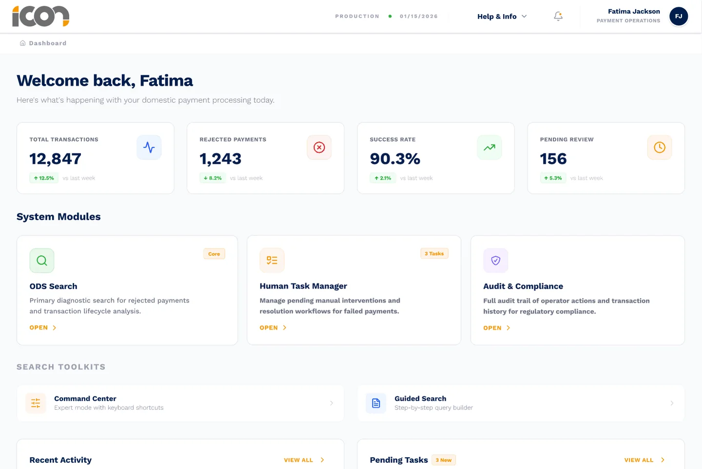
Overview
Icon Solutions builds the transaction processing infrastructure behind some of the world's largest banks. Their IPF Dashboard is the operational nerve centre where teams monitor payment flows, handle exceptions and configure processing rules across thousands of daily transactions.
I joined as the first dedicated designer, embedded directly in an engineering squad. The brief: audit the UX across four core modules (ODS Journey Summary, Processing Settings, Human Task Manager and Audit), close the accessibility gaps ahead of an ISO 27001 compliance review, and establish a branded design system that could be white-labelled for each bank client.
The challenge
The dashboard had been built for technical configuration rather than daily operations. It surfaced every data point at once, whoever was looking and whatever they needed to do. My heuristic evaluation found systemic issues: no visibility of system status, limited user control over workflows, weak error prevention, and a visual hierarchy that treated all information as equally important.
Operations staff were overwhelmed. Engineers were frustrated by simplifications that hid the data they needed. And the product couldn't pass a WCAG 2.2 AA audit, which blocked the pending ISO 27001 certification.
Managing priorities
Twelve weeks meant being ruthless about sequence. Three priorities, in order:
- Reduce cognitive overloadThe most-cited pain point across JIRA tickets and stakeholder interviews. If operators couldn't find what they needed, nothing else mattered.
- Close the accessibility gapsThe ISO 27001 review was imminent. WCAG 2.2 AA compliance wasn't optional, it was regulatory.
- Establish the design systemIcon needed white-label capability. Without a tokenised, documented system, every new bank deployment would mean ad hoc reskinning.
Deliberately deprioritised: advanced analytics, onboarding flows and mobile responsiveness.
Research without users
I had no direct access to end users: the platform served operations teams across several banks, and fieldwork was out of scope. So I built a proxy method. In structured workshops with the PM and engineering leads, the team rated its confidence in every assumption about user behaviour: green (seen directly), amber (inferred from tickets or analytics) or red (pure assumption). I cross-referenced the results against 28 JIRA user stories and the existing Confluence documentation.
Fatima
Bank operator · daily user
“I lose my flow and context between views, which slows me down.”
NeedsActionable information only, stripped of technical detail she couldn't interpret.
Ali
Payments engineer · power user
“Too much information I don't need, and too many clicks to get where I want.”
NeedsRaw, untranslated data. Interface simplifications actively frustrated him.
Andrea
Payments manager · supervisory
“I can't see the status of exceptions being handled.”
NeedsVisibility across the team's work, not just her own queue.
The core decision
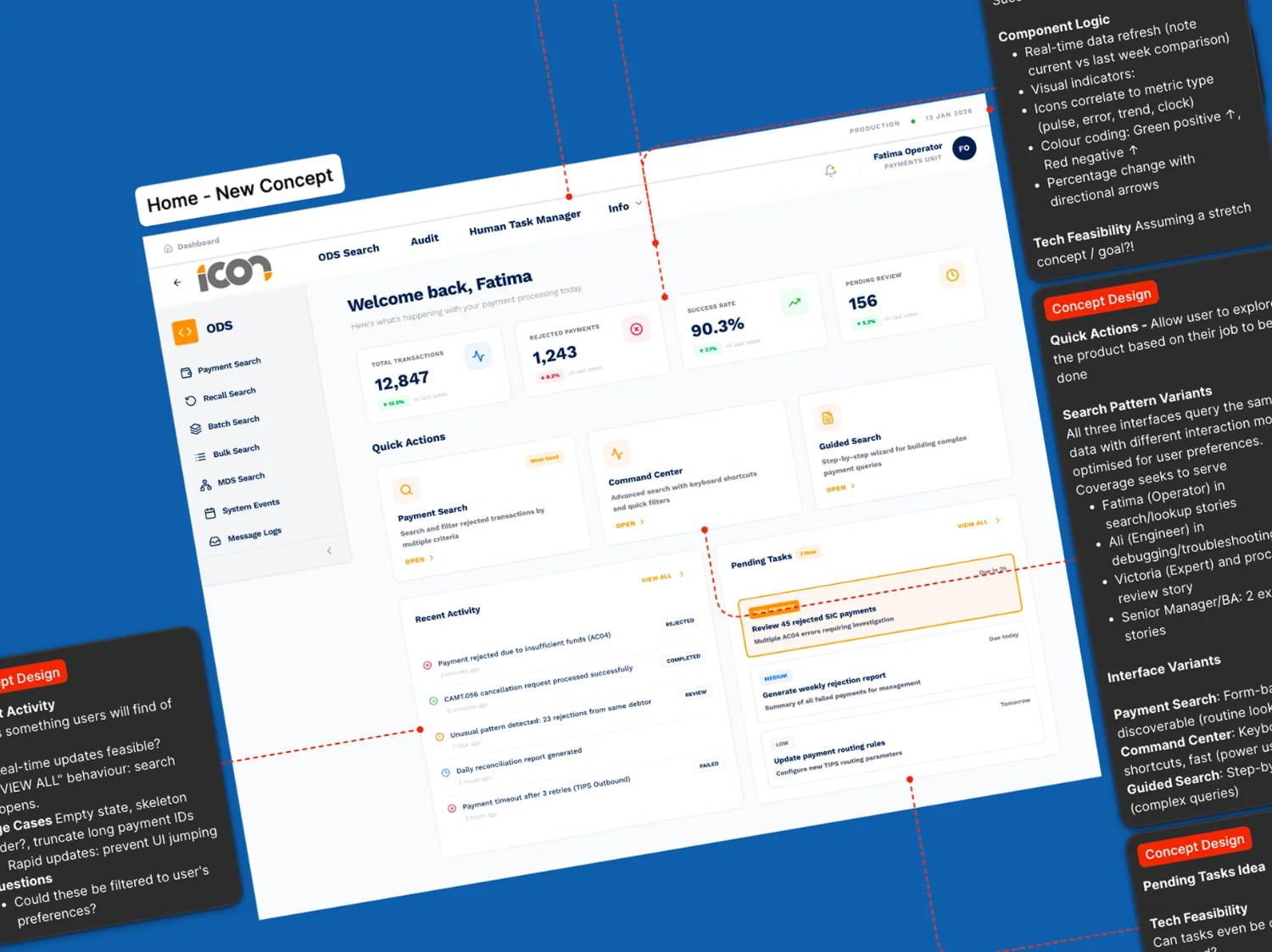
Fatima and Ali used the same screens but needed opposite things from them. Fatima needed progressive disclosure. Ali wanted every field, every raw value, every system identifier. A single view could not serve both, so I explored three approaches.
What I delivered
- Heuristic audit
- 58 findings across four modules, each severity-rated P1 to P4, mapped to the persona it affected, with remediation and a PI-roadmapped delivery plan. 12 were P1, mostly error prevention and system status.
- Four working prototypes
- Built with the engineering team using Claude Code and Figma MCP, tested against real PrimeNG constraints from day one.
- Progressive disclosure model
- Role-based defaults with the contextual side panel, implemented across ODS Journey Summary and Human Task Manager.
- Processing Settings lifecycle
- State-aware search so operators can see whether a setting is scheduled, pending approval or active, collapsing a three-screen workflow into one filterable view.
Design system
I rebranded 84 PrimeNG components to Icon's 2025 identity and started a tokenised system built for white-label deployment across bank clients.
| Typography | Migrated to Work Sans for headings and Inter for body, with a defined type scale. |
|---|---|
| Colour | Role-based semantic tokens (for example --color-status-pending, --color-action-primary) tested against WCAG 2.2 AA, plus a component-by-component contrast audit. |
| Token architecture | A custom Figma plugin syncing PrimeNG CSS variables both ways between Figma and code via a Docker and WebSocket MCP integration. |
| Accessibility | Every component state annotated with keyboard patterns, screen reader expectations and focus behaviour. |
What happened next
In early March the team moved to a fully AI-generated pipeline, from Claude Code straight to pencil.dev, bypassing a traditional design layer. My contract ended as a result.
The work survived the pivot. The audit findings, persona framework and progressive disclosure model kept informing the AI-generated outputs, the design tokens became the foundation of the new pipeline, and the confidence-rating method was used in later sprint planning.
Reflection
Design value in an AI-native pipeline isn't in pixel-perfect specification. It's in the judgement layer: knowing which problems to solve, for which users, with what trade-offs. That's the work that doesn't get automated away.
The confidence-rating workshop is a technique I'll use again. It forced honest conversations about what the team knew versus what it assumed. And the project confirmed the direction I'm heading: code-adjacent, AI-native product design in complex, regulated industries where the interfaces can't afford to be wrong.